
The idea came when a friend and colleague asked me to model a High resolution model of the Combine APC from Half Life 2 to be used in short film he wanted to shot. Since it was supposed to be a live action, the vehicle had to look realistic and be believable as a real asset. I took this chance to push my modelling, texturing and lookdev skills trying to achieve the best look possible, without limitations of poly count, or number and resolution of textures. Through the phases of this making-of I’ll focus more on the ideas I wanted to develop, and the problems I faced on the way, and the methods I used to resolve them. Technical proficiency is only one aspect of creating digital images. Balance, composition, mood are extremely important too, and can make the difference between a good image and a great one.
Modelling
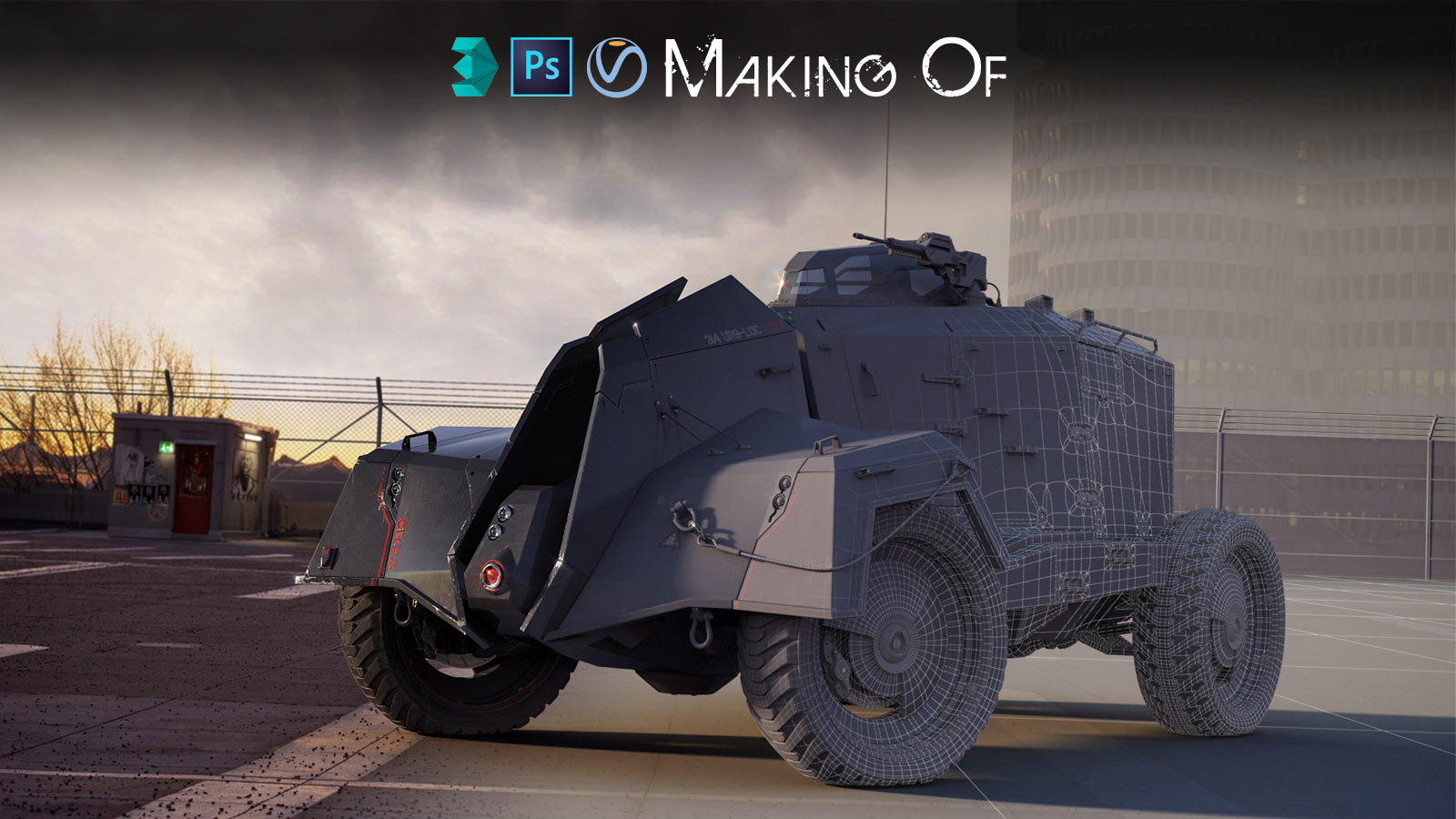
My friend asked me to maintain the overall shape of the original APC game model. For the rest, I’ve been free to experiment and come out with my own ideas. The look is very peculiar, and has a very well balanced mix of World War 2 and Sci-Fi elements in it. Real military vehicles usually don’t look very cool, but all the details like door handles, antennas, hatches, nuts, bolts etc, are built with in a proper way and serve a real purpose. On the other hand, fictional Sci-Fi vehicles usually have a great design and look very dramatic, but can lack functionality and logic. So I gathered lots of images of real APC, trucks and tanks from past and present times, as well as stills of famous armoured vehicles from legendary Sci-Fi movies or games like Aliens, Batman’s Tumbler, District 9 and Half Life 2 itself (Fig 01).

I took some reference shots of the original model from Half Life 2 made by Valve and I modelled the main volumes and the wheels. Just using the basic model ling tools, piece after piece, I assembled a replica of the main volumes of the APC (Fig 02). If you break up any complex model into small areas and you focus on each piece one per time, there is nothing too complex to achieve. Modelling is pretty much all about that.

Then, for the smaller realistic details I just had to model them as they were in the reference photos I chose. For other elements, such as the rims, the headlights or the roof, I tried different solutions. It was a trial and error method, and I discarded and remodelled them until I was happy (Fig 03). In cases like this, I use any method that will allow me to save time. Usually I take a screenshot of my viewport in a prospective or ortho view and do some quick paint-over in Photoshop, so I can understand if what I have in mind works or not.
 Another little trick that may not be obvious: I created over the years a database of nuts, bolts, and common simple objects, with proper UV. I selected some and I used them all around the model. During the UV work and texture work, this will pay off a lot. (Fig 04).
 As I model, and my number or objects grows, I always take some time to keep my scene organised and tidy. Giving proper names to objects, with a proper prefix, and creating some layers to quickly hide set of objects saves a lot of time, and headaches, in the long run. Especially, if you have to pass your work to someone else, It’s good habit to keep your scenes clean. (Fig 05).
 When I was happy with the look of the model and I got it approved from my friend too, I moved on the UV. At this point I had a reasonably good idea of how much detail you will need, and which areas are required more care.
I split the vehicle into 6 areas of roughly similar volume: front, main, rear, framework, wheel and another one for all the small details. I kept the rifle separate, since it was going to be used also as a separate asset. Each became a UV tile, and had a 4096×4096 texture. (Fig 06)
 It is very important to maintain a similar scale all across the model when doing the UV. Often, during the process, I shift some geometry from one tile to another if I can’t get enough space. Keep a checker shader handy to constantly see if everything matches. Similar scale means same level of detail across different objects, but also sharing the same maps during the texture work.
I try to avoid any kind of overlap, even if I have many insignificant objects that could share the same UV. That will give me full control during my texturing work, and avoid nasty results that I’ll have to fix when I’ll bake the maps.
Texturing & Lookdev
Before I start describing my work process I want to spend a minute to explain a couple of things about gamma and LUT. There is plenty of tutorials and discussions on the forums on this topic, and many different settings. I don’t claim that mine are the correct ones, I’m just sharing my workflow. In the gamma and LUT settings of 3Ds Max you can decide how your render engine and your viewport are gonna handle your images and textures.
Enable it, but leave everything as it is. Otherwise you will display overexposed textures in the viewport and you won’t affect Vray at all (Fig 07 A/B). Vray has its own panel with LUT settings for the render, and those are the settings that count in the end. Max or Vray framebuffer will show the same result.
I don’t use gamma 2,2. Dark areas come too bright, even for daily exteriors like this one. I tend to keep it at 1.8, it gives a better contrast to the renders. (Fig 07 C).
 In Max’s viewport I keep my models in constant color while I’m working on the textures, so I see exactly what I’m doing in photoshop, and I don’t have any distraction from the shading. If it’s looking nice with flat colours, is going to look even nicer once is shaded. Even with an extremely powerful render engine like Vray, I don’t expect it to do all the work for me, and I try to make my diffuse textures appealing and the shapes of my models recognisable even without any lighting. Texturing is the most important part of creating a great model. You can let an average model shine with a fine texturing work, or an outstanding model very plain and boring. All the shading process, specular, bump, etc. will help, but the diffuse have to be flawless first.
Here is the basic workflow I used: First of all I decided the overall color for the entire vehicle. It had to look like police force vehicle, so I did some research for police force vehicles. Dark blue with red stripes is the typical color scheme of an Italian police force: Carabinieri. I tried different palettes, gray/orange, black/red but eventually I chose this one (Fig 08B). Then started to play with screen-grabs in Max or directly on the textures in Photoshop, quickly adding details, trying to maintain the characteristic minimalist look, adding details in the right places. I got most of the ideas from military airplanes or tanks, and when I started to search for scale models decals, I found loads. (Fig 08A)
 Any metal, plastic or rubber surface of a vehicle, will have some common elements that will determine how old, worn and ruined that surface will look. Those elements are mud, dirt, dust, rust, scratches and so on. I took a sample object from my model that had pretty much all the shaders I needed, and I did all my experiments with that object, so I could play with the textures and shader values quickly, and then I replicated it to the rest of the vehicle for a final tuning. I wanted to autogenerate a map for each of those, and then work to correct and improve them in Photoshop. So I made an extensive use of VrayDirt map. I created a vray material, and in the diffuse I added a VrayDirt map. Playing with the values and adding different maps, I created and then baked four different maps:
- Ambient occlusion (to be used as is and as mask for small dirt)
- Convexity map (to give a subtle highlight to the edges of metal surfaces)
- Scratches (very basic map to start with when painting scratches)
- Mud (for the rubber of the tires)
I’ve to credit Neil Blevins and his SoulBurn scripts. There are so many useful tools there. Among them there is one I use often: texmapPreview. That script will render a preview of the map I have selected in my material editor. It’s awesome when I need to tweak values. (Fig 09)
 Once I baked all those maps i masked them in Photoshop and I removed all the areas I didn’t wanted. Then I used the results as a mask itself for the scratched metal texture or the mud texture. After working on those layers, I started to add another level of hand painted scratches, stains, oil leaks etc. On top of all that I put the convexity map, masking out all the surfaces but the metal. Convexity map simulates the Fresnel reflections. On top of everything I applied a 50% ambient occlusion. (Fig 10).
 In Photoshop I try to be less destructive as possible and I keep the layers separate. So, when i finished my diffuse texture, I could create create on the fly the specular, glossiness, bump and paint mask just adding masked adjustment layers. (Fig 11)
 When I prepare a mask, I do some render tests with numeric values and, when I’m happy with the look, I convert those values into a base color in my maps, and then add brighter or darker areas according to the effect I need. I used the same method to prepare all the other textures, sharing the maps as much as I could. (Fig 12)
 All the shaders were pretty simple. Since my friend was not going to use Vray for his renders, I tried to achieve every aspect of the shaders just with masks and textures. For example, for the car paint I needed to have a clean base with subtle and blurry reflections, then a coat for higher ones, metal scratches with high specular values, and on top dirt and mud which are flat shaded and are supposed to cover the reflections underneath. I used Vray’s car paint shader, which has already a base layer and a coat layer, with a mask to cut off the reflections and specular from the coat. (Fig 13)

Lighting
As I was testing the shaders I started to set up the final scene with proper lighting, cameras and environment. I wanted to place the vehicle in a real urban environment, which I wanted to modify slightly to make it look a little bit more like the original City 17 of Half Life 2, which looks like a huge prison camp. I found a free set of photos I liked an HDR image I could use to create my image based lighting on www.smcars.net. I made a selection of 5 shots, and I tried to match the photo angle with my cameras (Fig 14). I discarded the last two mainly because of bad lighting: the first is in favor of the sun, so is pretty flat, the last one had the opposite problem.
 There are various methods to to it, according to what you have on the original image. In my case I didn’t had a reference cube, so I assumed that the shots were taken on a tripod tall 1,50 meters (except for the 2nd camera). I created different Vray cameras and tried to match the existing fugue points with a grid placed in 0,0,0. It’s trial and error here, but every image had a quite recognizable grid on the ground, so it wasn’t very difficult. The scale is another guess, but the parking lot lines helped. When I work with a scene that will produce more than one still image, I create an animation: one frame per camera, and I key all the values I change between them. In this case I had 3 cameras, so I set keys for the 3 positions and rotations of the APC, slight changes in the position of the lights, depth of field values, small rotations of the HDR map, even shader values if needed, and so on. It may not be the most orthodox way to handle this, but works for me, and allow me to maintain only one scene for all the renders, and an easy restore point when I do experiments. The light setup is very basic, as I just had to match the existing lighting of the backplates: one HDRI used for image based lighting and one VrayLight used to simulate the sun. I didn’t used the vraySun or a directional light (which are better lights in a daylight condition) because I liked more the shadows generated from the VrayLight. One of the great advantages of linear workflow is that there is no need to pump up the values of lights to get decent results. I kept both my lights invisible, since I didn’t want them to interfere with my HDRI. And let only the IBL to cast reflections. (Fig 15)
 One easy method to match the HDRI with the backplates and then the sun to the HDRI is to assign that HDRI to a huge sphere in the scene. Then in the camera view you can toggle the visibility of the background while rotating the the HDRI. Then you have the position and a rough rotation for the sun too. I use the HDRI rotation and the sun position as a guideline, then I try to move them a little bit to hide ugly reflections or to get better lighting. After all the image has to look cool, it doesn’t matter if its not 100% accurate. (Fig 16)
 I used Vray Physical Cameras. Since my back-plates were raw photos, I could match the lens, aperture, f-stop and so on, which made my life way easier. Plus, since I had more than one camera, I tweaked the cameras values rather than the lights for each render. (Fig 17)
 To project the shadows of the APC on the Tarmac, I created a plane and assigned a VrayMtlWrapper to it. It replaces the old Matte/Shadow of 3DS Max. With few simple settings its easy to make it work. (Fig 18)

Composition
Finding the right composition in all the photos it has been quite complex. There are plenty of things to keep in mind, easy in theory but very hard to achieve. I’ll try to make a logical and easy path to follow.
- Angle: as I finished the model I knew from which angles it looked nicer. So all the images exposed the best angles and I avoided the worst ones. Banking the camera a bit gave a tougher and sinister feeling too.
- Lighting: I tried to highlight the nicest features, while creating nice contrast and darken less interesting areas at the same time. I had to match a pre-existing light setup, so it got even trickier, because I was constrained by the lights. I generally avoid flat lighting like hell, and I carefully place all my lights one by one.
- Balance: I followed the “rule of the thirds” as much as I could, avoiding placing the vehicle in the centre if the image, too high or too low. I made it a third taller or shorter than the closest elements in the background, so it popped out a bit. Anything obstructing the reading of the silhouette was removed from the background too. I decided to remove some of the background elements I added in my first sketches, since they were distracting.
- Color: The vehicle had a little more contrast than everything else, just to put it a little more in the center of attention. On the other hand it had to be integrated in the surrounding environment too. So color correction of the passes with the vehicle was extremely important.
- Integration: the most important thing for make a composition believable, is to have or create both background and foreground elements to surround the main asset. I couldn’t do it here properly. There is just a hint of this in the 2nd camera with the pebbles out of focus. (Fig 19 A/B)


Postprocessing
I split my final renders into several passes. It takes too much time and effort to create a single pass with everything tuned to perfection, and it’s not versatile at all. Post production is another fundamental process to convert a good render into a stunning image. But I don’t create a huge number of passes if I don’t need them. In this case I kept all the vehicle passes together, and I focused more on integrating the backplate with the CG elements. These are the passes I rendered. (Fig 20)
 During the lighting and compositing process I did some minor modifications in Photoshop to the backplates. Mainly was about removing structures and details that could distract the attention from the APC or make harder to read the silhouette. The sky is extremely important to set the mood, so I spend some time to find one and retouch it. (Fig 21)
 This is the schematic view of my layer structure in Photoshop. (Fig 22)
Conclusion
I am pretty satisfied with the results, I believe I maintained the original feel of the combine APC, and I achieved a good degree of realism overall. Of course this work is far away to be perfect, I could have worked on the model a bit in Zbrush or Mudbox to add details to the surfaces. Texturing work is never enough, and for example there is no dust map, that could have given some more detail to the surfaces. The glass on the roof is sparkling clean, the underneath of the model is still quite rough. I’m not 100% convinced with the paint shader, I believe the vehicle is too shiny in certain areas, so I should have rendered the reflections on a separate pass and mask out some areas. Anyway, I gave myself a deadline to finish this work even If I didn’t had to. There is always something left out in every work. In the end I wanted to improve my hard surface modeling skills and my capability of handling a complex asset like this one from the beginning to the end. I hope you enjoyed reading through this making of and the concept I explained here are going to be useful for your project!
To see the final images follow this LINK.